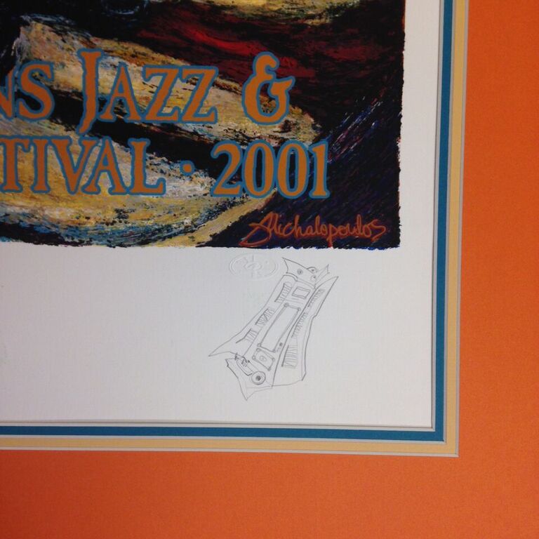
A question we often get from our customers who come into the shop with their Jazz Fest poster is "What do people usually do?" The answer is, "Everyone does it differently!" Here we will show you some example of what customers do with their Jazz Fest poster collection. Scroll down for pictures!
Because they are so colorful, Jazz Fest posters give you an opportunity to do some fun things with matting. Often our customers will design their piece with a double or triple mat, choosing the mat colors based on the palette of that year's poster. One of our customers chooses her mat color for each year's poster based on the outfit of the featured musician.
If you are going to go bold on the mat colors, it's best to stick with a simpler frame. A simple black frame is suitable. A gold frame that has a more modern finish will add a metallic quality that echos the brass instruments pictured in some posters. A rustic wood frame works well when the poster features typical New Orleans architecture.
Customers who are avid collectors will usually streamline their Jazz Fest Posters: same frame on every one but with a unique mat for each year. Others will design the piece to be completely unique, drawing from the style of that year. It is really up to you!
Another thing to consider is how much wall space you have. A mat adds several inches of border around a decent sized poster. If you are worried about it getting too big, you can forgo a mat altogether and just put a frame right around the edge of the poster. When this is the case, some customers choose a more exciting frame. You can make it classy with an ornate gold frame, or keep it casual with a thin metal frame. This is also a more affordable option if you are working with a limited budget.
Need some direction? Here are some example of what customers have chosen over the years for your inspiration:


